Hello Camunda community!
I am working on the design of a new section of the Cockpit webapp and need some feedback about the readability of te displayed data in that section.
Values on the right:
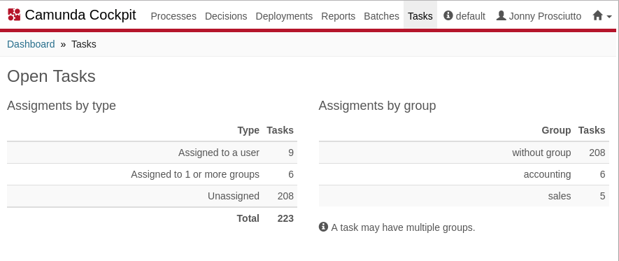
Values on the left:
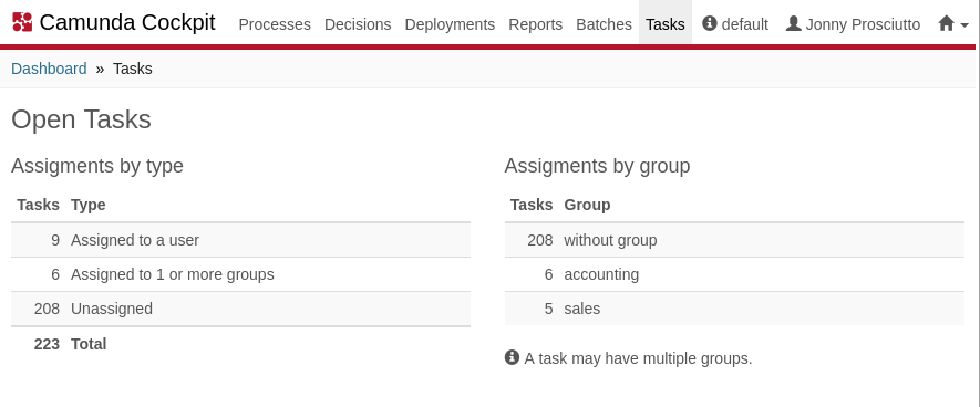
- Values on the right
- Values on the left
0 voters
Thanks in advance to the participants!
Vale