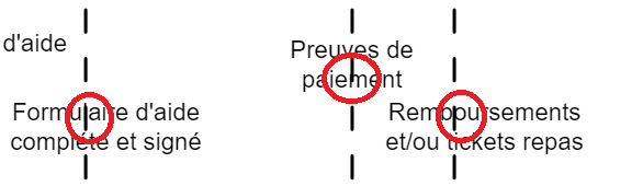
The modeller displays message connectors on top of the message labels, which can lead to readability issues. On workaround is to move the labels away from the connectors. But I think it would be great if the labels could be on top, ideally with a white background (similar to the way Visio for example handles labels and connectors).
I’ve tried experimenting with the “style” plugin, but so far unsuccessfully. Anyone knows about a possible solution ?
Thanks,
Nicolas
Can you maybe share a screencast or a couple of screenshots which show the behavior you describe?
BTW, I’m using v3.7.0 of the modeller.
To verify, is that the behavior you see?
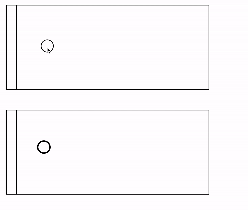
Yes, absolutely.
As can be seen from your example, the ‘a’ and the ‘g’ are covered by the connector and not easy to read.
Thanks for reporting this! Maybe we can improve that situation in certain situations. I created an issue for that: https://github.com/camunda/camunda-modeler/issues/1734
1 Like
Thank you for that.
I’ve noticed that your proposed solution is to have the label be automatically moved away from the connector.
An alternative solution would be to add a white background behind the label and to “move it to the front”. This is the default behavior of several diagramming solutions (Visio, draw.io…) and personnally my preferred option.
Thanks for your thoughts! This might be an even better solution, I added that to the issue description