Hello!
An other poll to ask you where the confirm and cancel buttons of the inline fields should be placed.
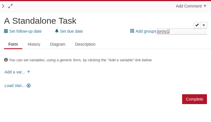
Below the date field:
Above the date field:
- Below the date field
- Above the date field
0 voters
Thanks for the participation!
Hello!
An other poll to ask you where the confirm and cancel buttons of the inline fields should be placed.
Below the date field:
Above the date field:
0 voters
Thanks for the participation!
What about displaying the buttons at the right side of the date-field? (I don’t know if it is possible)
Cheers, Ingo
Hello Ingo,
everything is possible ![]()
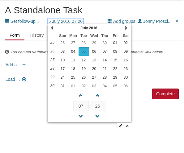
on the other hand, I would personally, position the other confirm/cancel buttons consistent and it might be tricky then with other fields which (may) need more horizontal space:
So I didn’t took that option into account (for now).
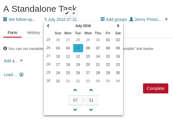
I might be old fashioned but imo the buttons should be inside the datepicker and called ok / cancel 
There is enough room to put the buttons aside of the time picker fields but I never considered that solution because I find it odd to have to go search down below for the buttons.
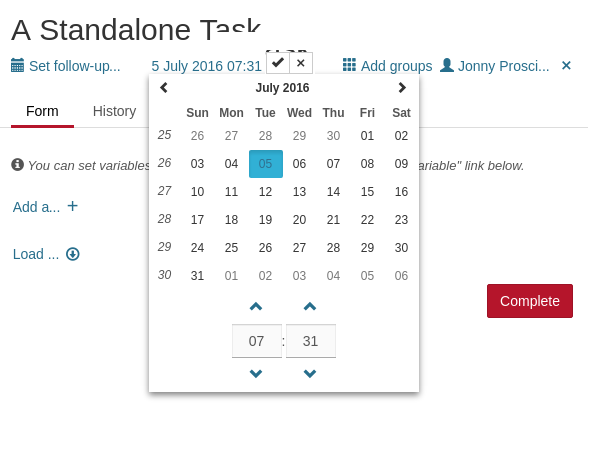
Alternatively… we could “create” some room for those buttons above the “month name” and put them here.
But again, I would rather have those buttons above the field because of consistency. my 2cts.
Consistency is fine but a typical workflow would be to fill out the form from top to bottom. Then you would need to move up the mouse again over the complete form, isn’t that kinda breaking ux?
Well… depends… if somebody is used to have the button at the same place (consistency), having them, in some cases, elsewhere… that’s “breaking” the UX.
IMVHO